Art of Cover- Art, Two
With the release of book 2 in the Broken Promise series, it only seems right to return to the subject of cover-art. In the first article on this topic, I covered my process of creating the cover image for my book and this article will be much the same.
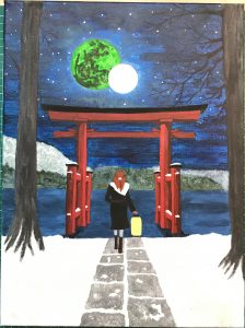
As I tackled this project, I had a far clearer image in my mind of what I wanted to achieve. I wanted to do a nightscape in the snow, capturing the moments of the New Year celebrations which occur about two thirds of the way through the book.
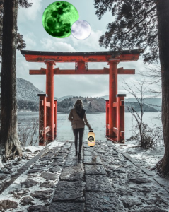
So as before I trawled the internet looking for images to use as a reference. Initially I had envisioned a procession of Japanese-style spirit gates flanking a staircase, but I came across this image and quite fell in love with it. I added the moons and the lady’s lamp, but made no other significant changes as the composition was nearly perfect.
To prepare the canvas I painted it in a shade of dark blue to help set the tone for my midnight colour scheme, then I transferred on the image using carbon paper. This plan quite fell apart as the blue lines made by the carbon paper matched perfectly with the background blue I had used. So, with the application of a thin layer of white paint I tried again.
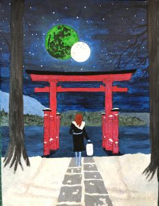
You can clearly see I deliberately left out certain details from the original composite image when I made my transfer to simplify the design. I omitted the shrubs on either side of the pathway, and at the same time chose to reduce the path to just the central flags. With it been a winter scene it made sense to lengthen Keyanna’s coat and turn the scarf into a fur shawl.
Setting the scene for my cover at night presented many challenges, mostly keeping the image from being too dark. To have the pine trees in black silhouette, I had to paint the night sky dark blue with its reflection in the murky water of the river.
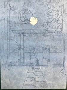
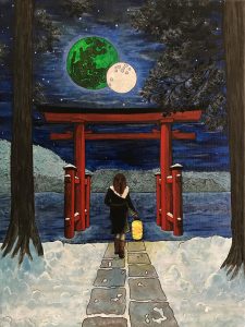
I experimented with a moon shadow from the spirit gate cast across the snow, but from this image of my work in progress you can see it just looked wrong.
As I added more detailed shading to the spirit gate the image began to appear more three-dimensional. I also began to pick out the details of the wooded area on the far side of the river. After I removed the moon shadow, I added more detail to the path and really cleaned up the dirty looking snow. I also finished blocking in the last of the non-detailed areas such as the lantern and Keyanna’s legs.
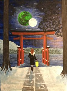
In this image you can see I’ve reintroduced some shadowing and shading to the snow, along with a lot more detail on the far bank and the pine needles on the trees. I experimented with thin clouds in the sky veiling the moons, but settled on giving them a glowing aura.
At this stage I also spent a lot of time working on the river texture, I wanted to show a slight reflection of the opposite riverbank and show ice forming around the base and supports of the spirit gate. It was my intention to make the whole image appear cold and dark without being overbearing.
Before adding my characteristic ink outlines, I added a dusting of snow to the pine trees, the finished effect didn’t work as well as I hoped, but it did help the pine tree silhouettes stand out a little more.
I added a brighter illumination to the centre of Keyanna’s paper festival lantern to give the effect of it glowing, as well as creating lighter areas to Keyanna’s coat and trousers. It was about this stage I realised I’d drawn her legs far too thin, so I carefully filled them out as I added light and dark shades to her brown leather boots and grey leggings.
When adding the ink finishes, I picked out lumps and bumps in the snow along with the design on Keyanna’s silver hairpin.
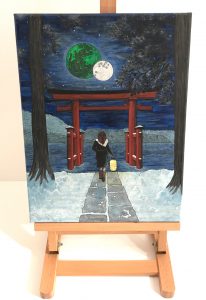
Once I was satisfied with my finished artwork, I used an easel and lightbox to ensure the best conditions for photographing. There are perhaps easier ways to convert an image on canvas onto a digital medium, but my scanner wasn’t big enough.
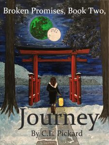
When I found myself at the end of this process, I used Microsoft’s Paint 3-D to add the text to the artwork, as well as correctly trimming the image.
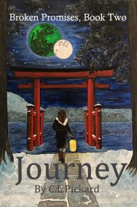
In the 18 months since I had carried out this process on my first book-cover, I had learnt a thing or two. I spent more time choosing the text, as I wanted to make it clear that this story has its serious side and is not suitable for young children. As with the first book-cover I used bold white lettering to depict the series name and book number, as I didn’t want the title of the book to cover the moons I moved it down across the snow where it’s picked out boldly in large dark grey letters, along with my name.
Unlike Beginnings, Journey was initially intended to be a working title, until I came up with something better. Perhaps writing about the unimaginative Artens has rubbed off on me, and I couldn’t think of a better one, so the name stuck.