Art of Cover Art, one
It’s been a year since the release of Beginnings the first book in the Broken Promise series, so I have decided to share the process behind creating the cover art.
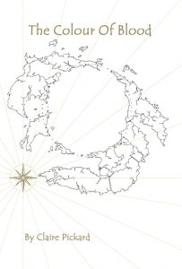
Starting at the very beginning with my first concept for the cover art, shows that I haven’t even settled on a title. In my first article on character building, I mentioned that my original story was titled ‘Learning to fly’ and for a time I considered calling my story ‘The colour of blood’. This title includes a reference to the original prologue, in which Keyanna’s grandfather, still sitting as Guider, settled an argument by stating that ‘he is destined to lead by the colour of his blood’. Like so many things the title seemed like a good idea at the time, but as the story developed, I felt it didn’t represent it anymore. This cover art shows the world map of Gear but is otherwise quite plain. Whilst I continued to use the same world map, I decided that my book cover should represent my story more colourfully in future.
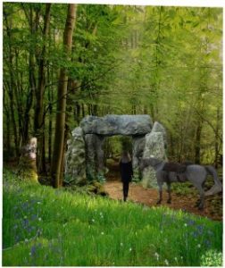
I am no skilled artist, so when I decided to attempt my own cover art, I trawled the Internet for images to give me some inspiration and guidance. I already had in mind that I wanted to depict a key moment from the story, I settled on the magical location of Stonegate Forest. This image was created by combining elements from different pictures, the foreground and background are from two different woodlands, the stone archway, the woman and the horse are all layered in separately. By bringing all these elements together I was able to work out the composition for my cover art.
Before I started my painting, I realised the image was too wide, so I lost part of the foreground with the tree stump. I printed out my composite image and traced it on to a canvas using carbon paper. Almost like painting by numbers I added in colour and shade to the various elements as I went along.
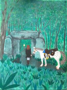
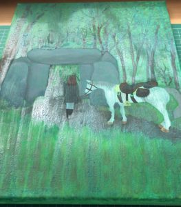
I changed Arrow’s horse-blanket from yellow to blue to help it stand out as the artwork progressed, it was also at this stage I decided to add the distinctive grey spots on his rear. In the second image you can see the foreground detail starting to come together.
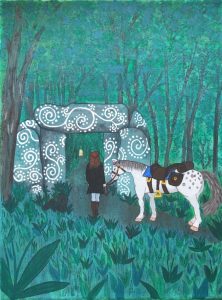
By using a black fine-nipped pen I picked out edges and details for everything in the image, from blades of grass to the leaves on the trees and the texture of the bark. I was able to include extra detailing on the saddle and emphasise Arrow’s muscular curves. I added more detail to Keyanna’s hair, to show how it is half tide back away from her eyes. More notably in the third image are the swirls and dots on the archway which I described as carvings that glowed with an inner light.
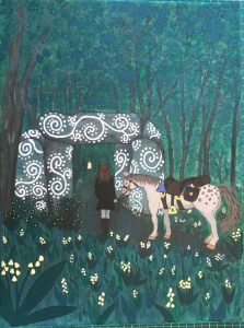
As the cover art neared completion, I added a little shading to the flowers in the foreground, which I intended to represent Convallaria majalis, also known as Lily of The Valley, May Bells, Our Lady’s Tears, or Mary’s Tears. As one of these common names suggests, these flowers bloom in May, yet the scene in Stonegate Forest takes place in autumn. I had contemplated having Keyanna follow the unicorn out of the glade of eternal summer, where the forest spirit dwelt, and once through the stone arch, the forest to be that of blazing autumn. I experimented with that idea but found it too hard to accurately express and I couldn’t find any images of unicorns that matched my description of them being like fat, comical, ponies.

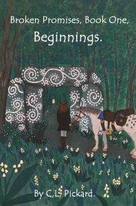
Even though I had narrowed the image from the start, I realised that it was still too wide when I began to upload the book through Amazon Kindle Create. As Keyanna and the Stonegate were the central parts of the image, I sacrificed a little of Arrow’s backside. After correctly sizing the image for the cover art to fit the template, I needed only to add the text. I experimented with using black text as it is a common finish on book covers, but the dark green background made black unsuitable, so I went for bold white. I chose this text font as it looked friendly, later on as I built my website and had business cards printed, I chose a more serious text font.
It’s interesting looking back on the development of the cover art, seeing how it came from a crude idea to a finished product, in a process not to dissimilar to writing the book itself. Bringing ideas and inspiration from multiple places together and incorporating them into a coordinated finished product.